
| 일 | 월 | 화 | 수 | 목 | 금 | 토 |
|---|---|---|---|---|---|---|
| 1 | 2 | |||||
| 3 | 4 | 5 | 6 | 7 | 8 | 9 |
| 10 | 11 | 12 | 13 | 14 | 15 | 16 |
| 17 | 18 | 19 | 20 | 21 | 22 | 23 |
| 24 | 25 | 26 | 27 | 28 | 29 | 30 |
- httr
- ggplot2
- 서평
- 웹크롤링
- kt aivle school
- hadoop
- ETRI
- python
- 에이블스쿨
- 빅분기
- KT 에이블스쿨
- 딥러닝
- Eda
- 소셜네트워크분석
- 빅데이터분석기사
- 한국전자통신연구원 인턴
- ML
- 하계인턴
- SQLD
- 다변량분석
- 시계열
- 가나다영
- 에트리 인턴
- kaggle
- r
- 시각화
- dx
- 지도학습
- cnn
- arima
- 기계학습
- SQL
- 프로그래머스
- 하둡
- matplot
- 에이블러
- 머신러닝
- KT AIVLE
- 한국전자통신연구원
- Ai
- Today
- Total
소품집
[KT AIVLE] seaborn library 옵션 정리 본문
seaborn 시각화 라이브러리 옵션 정리
1. 히스토그램 + kde 중첩

plt.figure(figsize=(13,6))

plt.subplot(1,2,1)
sns.histplot(data=titanic, x='Age', hue='Survived', bins=16,stat='density', kde=True, multiple='stack')
plt.title('seaborn 히스토그램')

plt.subplot(1,2,2)
plt.hist(data=titanic, x='Age', bins=20, color='pink', edgecolor='black', alpha=0.7, density=True,)
plt.xlabel('Age')
plt.title('matplot 히스토그램')

plt.grid()
plt.show()
- shade : 곡선 아래 공간의 투명도 설정(True / False)
- hue : 색깔에 따른 구분
- bins : bin의 개수
- kde = True : 커널밀도추정으로
- legend : 범례표시
- alpha : 투명도 조절
- density : matplot kde ver.
- grid : 배경 서식
2. 산점도
기본은 plt.scatter로 확인할 수 있지만 모든 feature에 대해 확인하고 싶을 때는 sns.pairplot을 사용
- sns.scatterplot도 hue 옵션을 적용할 수 있다.
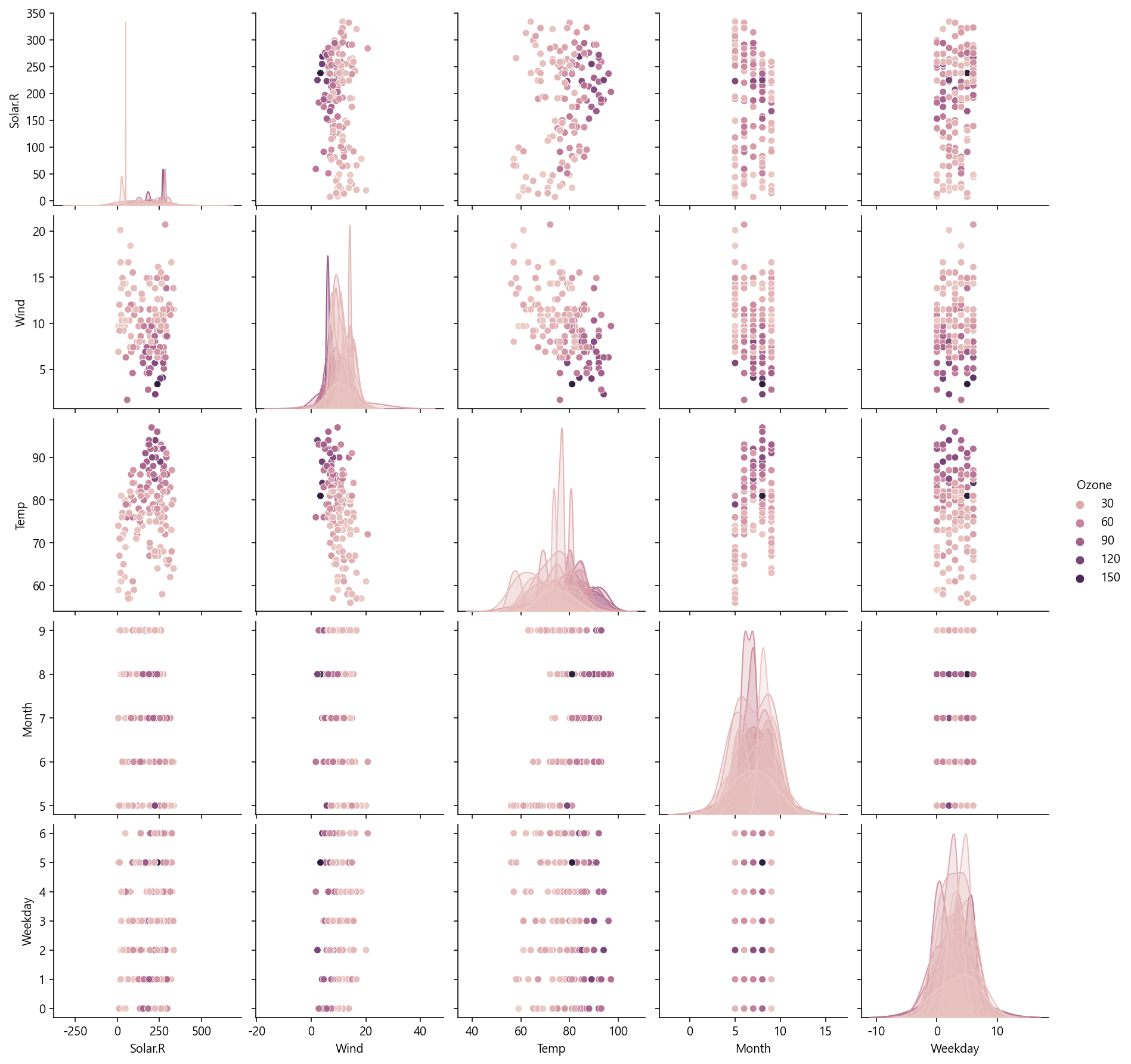
sns.pairplot(air,hue='Ozone')
plt.show()
3. 조인트 플롯 + scatter or hisogram


penguins = sns.load_dataset("penguins")

sns.jointplot(data=penguins, x="bill_length_mm", y="bill_depth_mm")
sns.jointplot(data=penguins, x="bill_length_mm", y="bill_depth_mm", hue="species")
sns.jointplot(
    data=penguins, x="bill_length_mm", y="bill_depth_mm",
    marker="+", s=100, marginal_kws=dict(bins=25, fill=False),
)
sns.jointplot(data=penguins, x="bill_length_mm", y="bill_depth_mm", kind="reg")
조인트플롯은 numeric feature 분포를 한 번에 확인할 수 있다.
4. Heatmap


temp1 = titanic.groupby(['Embarked','Pclass'], as_index = False)['PassengerId'].count()
temp2 = temp1.pivot('Embarked','Pclass', 'PassengerId')
print(temp2)

sns.heatmap(temp2, annot = True, cmap='Blues')
sns.heatmap(temp2, annot = True, fmt = 'd', linewidth = .2, cmap='Blues')

plt.show()
- 범주형 데이터를 집계하고, 그 결과를 농도로 시각화 함.
- 그래서 먼저 groupby와 pivot을 먼저 만들어야함.
- annot : class 간 간격을 띄우기
- camp : Blues, GnBu 등 컬러 옵션은 다양하게 있다.
https://chrisalbon.com/code/python/data_visualization/seaborn_color_palettes/
Color Palettes in Seaborn
Color palettes in Seaborn.
chrisalbon.com
https://seaborn.pydata.org/index.html
seaborn: statistical data visualization — seaborn 0.11.2 documentation
Seaborn is a Python data visualization library based on matplotlib. It provides a high-level interface for drawing attractive and informative statistical graphics. For a brief introduction to the ideas behind the library, you can read the introductory note
seaborn.pydata.org
palettes 참조 링크
'AI > KT 에이블스쿨' 카테고리의 다른 글
| [KT AIVLE] 에이블스쿨 미니프로젝트 2차 회고 (0) | 2022.08.24 |
|---|---|
| [KT AIVLE] 에이블스쿨 게더타운 이벤트!! + 지역 1등 수상..💙 (0) | 2022.08.18 |
| [KT AIVLE] 에이블스쿨 1차 미니프로젝트 회고 (2) | 2022.08.11 |
| [KT AIVLE] matplot library 옵션 정리 (0) | 2022.08.10 |
| [KT AIVLE] pandas 조건 걸고 컬럼 추가하기 (2) | 2022.08.07 |


